PremiumHero Type Website
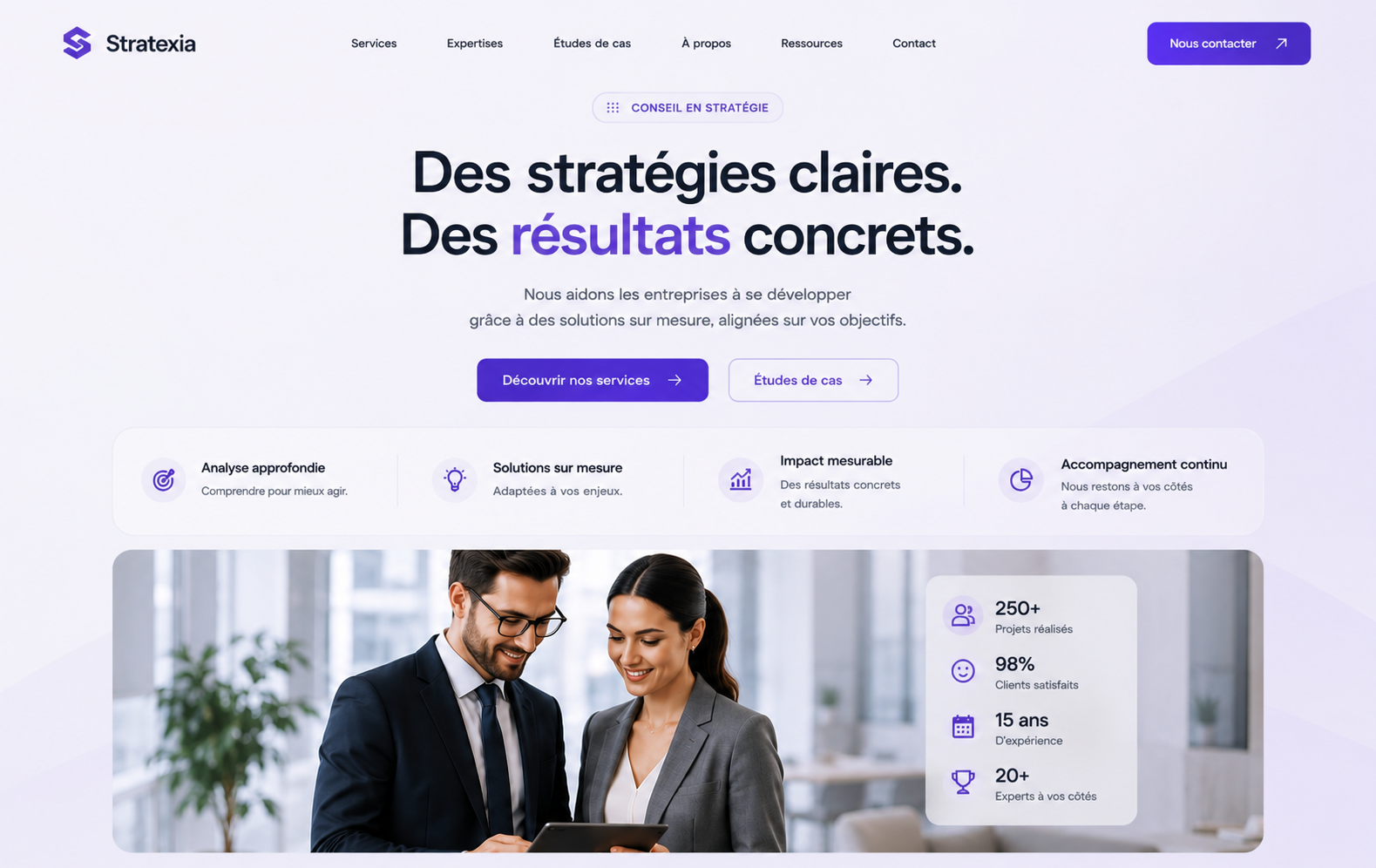
Strategy Consulting Hero
Hero de cabinet conseil centré, avec preuve de valeur, photographie et statistiques.
Temps
8 min
Niveau
Intermédiaire
Compat
Lovable · ChatGPT
Le prompt
Create a refined strategy-consulting hero on a luminous white background washed with very pale lavender. Use a centered editorial composition beneath a minimal navigation: a small violet eyebrow pill, an oversized two-line headline reading as a clear business promise, one key phrase in a violet gradient, a centered two-line subtitle and two CTAs. Add a wide translucent benefits rail with four equal columns, each containing a circular violet icon, a strong benefit title and one concise explanation. Under it, place a wide rounded photographic panel showing two consultants collaborating in a bright office. Overlay a compact frosted statistics panel on the right side of the photo with four vertically arranged metrics and icons. Use soft geometric lavender planes in the far background for depth without distracting from the copy. Animate the headline by lines, draw the benefit separators on entry, reveal the photo with a gentle clip-path, and count metrics when visible. The result should communicate precision, measurable impact and senior-level confidence.

Build this as a complete, production-ready website hero in React and TypeScript using Tailwind CSS and Framer Motion. Reproduce the reference composition faithfully while creating original brand assets and copy. The page must include a semantic header, responsive navigation, strong single H1, supporting paragraph, two purposeful calls to action, proof or feature items, and the main visual composition.

Interaction and quality requirements:
- Animate the entrance as a restrained cinematic sequence: navigation fades down, copy reveals line by line, the main visual scales from 0.97, and supporting cards enter with a short stagger.
- Add subtle pointer parallax only to decorative or photographic layers; never reduce readability or move interactive controls.
- Buttons need polished hover, pressed and keyboard-focus states. Navigation must become an accessible compact menu on mobile.
- Preserve the desktop hierarchy on tablets and stack intelligently on phones. Avoid horizontal scrolling, clipped badges, tiny text and layout shifts.
- Use semantic design tokens for every color, border and shadow. Keep decorative effects subtle and industry-appropriate.
- Respect prefers-reduced-motion by removing loops and parallax while preserving the final composition.
- Use optimized local images with meaningful alt text and lazy-load only content below the first viewport.
- Return every component, typed data object and helper needed to run the result. Do not use placeholders, TODO comments or non-functional controls.
- Add a subtle visual cue at the bottom of the first viewport so the next section remains discoverable without competing with the main call to action.
- Define reusable typed components for navigation items, benefits, statistics and trust marks instead of repeating markup. Keep data separate from presentation.
- Ensure every interactive control has an explicit accessible name, a visible focus ring, a comfortable touch target and correct disabled behavior.
- Prevent cumulative layout shift by giving media, mockups and floating elements stable aspect ratios and responsive size constraints.
- Include the exact final French copy in the implementation and preserve accents, punctuation and deliberate line breaks across responsive layouts.

---

TECHNICAL SPEC (must be respected)

Stack:
- React 18 + TypeScript (strict), Tailwind CSS, Framer Motion
- No extra animation library, no canvas unless explicitly required

Design tokens:
- Base background #0a0a0f, surfaces rgba(255,255,255,0.04)
- Borders rgba(255,255,255,0.08), primary violet #8b5cf6, secondary #a855f7
- Radius 20-28px, backdrop-blur(24px), inner highlight inset 0 1px 0 rgba(255,255,255,0.12)
- Typography: tight tracking on headings (-0.02em), 15-16px body, muted text at 60% opacity

Motion rules:
- Entrance: opacity 0 -> 1, y 24 -> 0, duration 0.7s, ease [0.16, 1, 0.3, 1]
- Stagger children by 0.06s, trigger with useInView({ once: true, margin: "-80px" })
- Hover: translateY(-6px) + soft violet glow, 250ms
- Animate only transform, opacity and filter. 60fps, will-change on animated layers
- Respect prefers-reduced-motion: disable loops, keep final states

Quality bar:
- Fully responsive (mobile-first, no horizontal scroll)
- Accessible: semantic HTML, focus-visible rings, contrast AA
- No layout shift, no dummy lorem ipsum, realistic copy
- Clean, reusable, production-ready components with typed props

Deliver the complete code, ready to paste, with no placeholder comments.Pourquoi ça fonctionne
Une hiérarchie centrale très nette installe l'autorité avant de présenter une preuve humaine et chiffrée.
Utilisation idéale
Conseil, stratégie, cabinet B2B, transformation d'entreprise.
Avis
"Utilisé pour un client barber, résultat premium en 10 minutes. Le meilleur investissement."
Sarah M.
"Le prompt fonctionne parfaitement dans Lovable. La qualité du rendu est bluffante."
Julien K.