PremiumPricing Animation
Interactive Pricing Calculator
Calculateur interactif avec sliders, options et prix estimé recalculé en temps réel avec compteur animé.
Temps
8 min
Niveau
Avancé
Compat
Lovable · ChatGPT
Le prompt
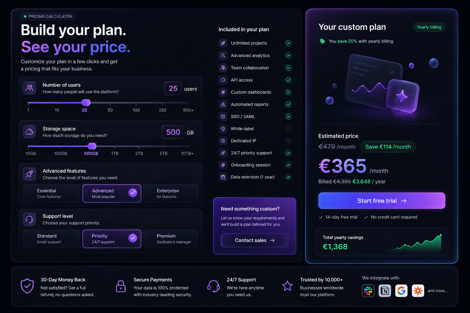
Create an interactive pricing calculator section, split in two glass panels.

Left panel:
- Eyebrow "PRICING CALCULATOR" with a green dot, a two-line headline with the second line in violet gradient, a two-line subtitle
- A "Number of users" glass block with an icon tile, a label, a boxed live value and a custom range slider with tick labels (1, 10, 25, 50, 100, 250, 500+)
- A "Storage space" block with the same structure (10GB to 10TB+)
- An "Advanced features" block with three selectable option cards (Essential, Advanced, Enterprise), the selected one bordered violet with a check circle
- A "Support level" block with three option cards (Standard, Priority, Premium)

Center column:
- "Included in your plan" list: 11 rows with icon, label and a state indicator (green check when active, grey dot when not) that updates live with the selected options
- A violet-bordered "Need something custom?" card with a "Contact sales" CTA

Right panel (violet-bordered, glowing):
- "Your custom plan" title with a green "Yearly billing" chip, a savings line, a small 3D glass illustration
- "Estimated price": struck-through original price, a green "Save €X /month" chip, an enormous violet price, the yearly billing line, a gradient "Start free trial" CTA, two reassurance items, and a "Total yearly savings" card with a small animated green area chart

Signature effects:
- Sliders use a violet gradient fill, a glowing thumb and spring physics on drag
- The price recomputes on every change with an animated number counter (250ms) and a brief violet flash
- Feature indicators animate from grey to green with a scale pop when unlocked
- Everything must remain fully keyboard accessible

Global art direction:
- Deep black canvas (#0a0a0f) with a subtle violet radial light leak behind the main content
- Glassmorphism surfaces: rgba(255,255,255,0.05) fill, 1px rgba(255,255,255,0.09) border, backdrop-blur(28px), inner top highlight
- Violet (#8b5cf6) to magenta (#d946ef) gradients reserved for the primary plan only
- Tiny star-dust particles and long soft light streaks in the far background, extremely low opacity
- Everything must feel expensive, calm and cinematic — never neon, never flashy

Content (French or English, keep it consistent):
- Section eyebrow pill with an icon
- Two-line headline where the second line is gradient violet
- One short supporting sentence
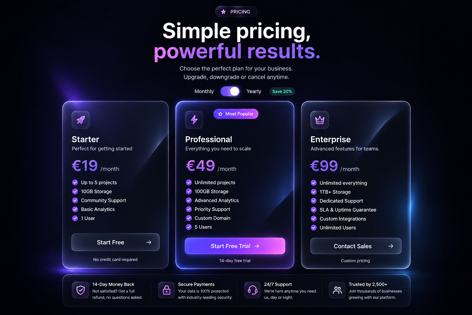
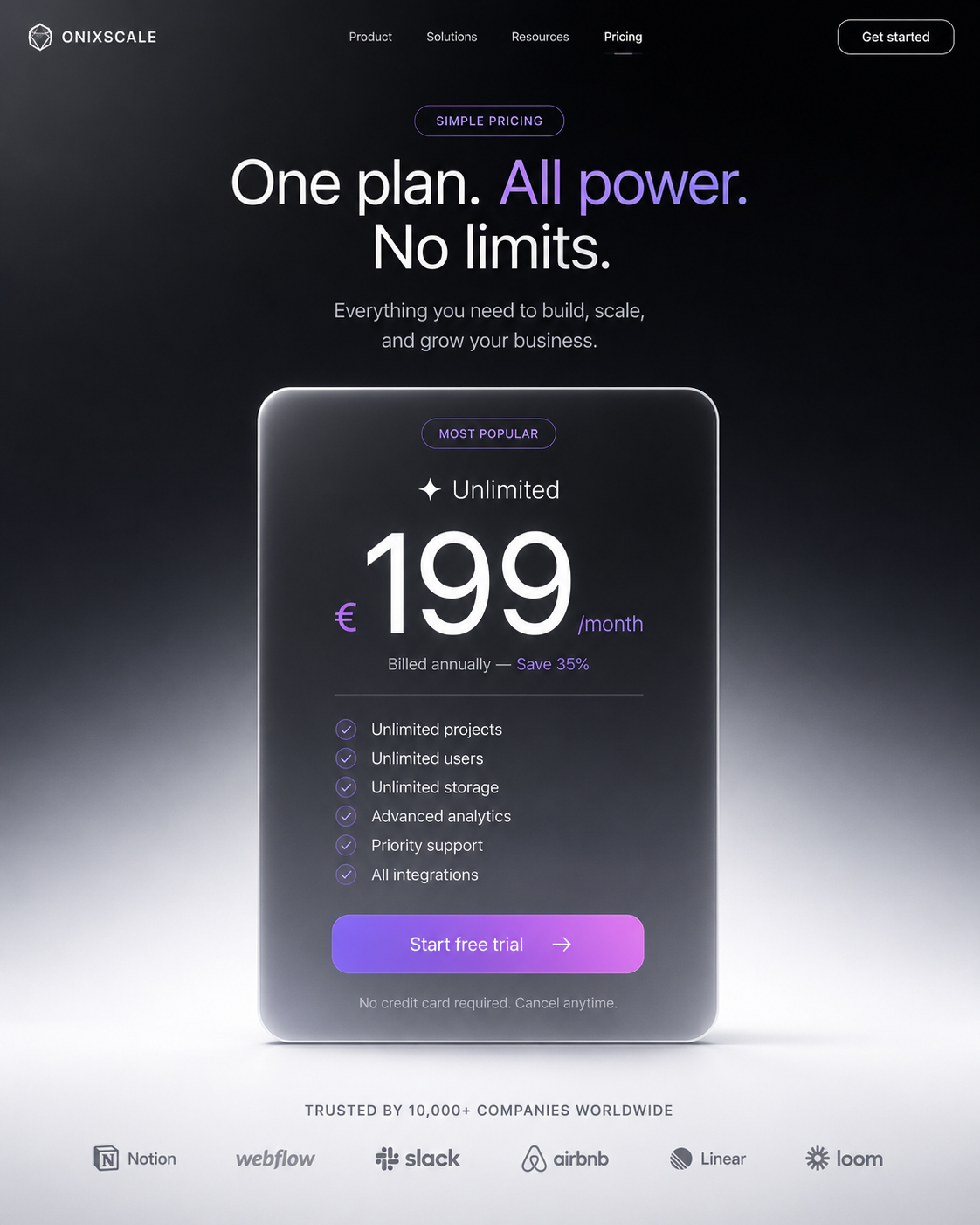
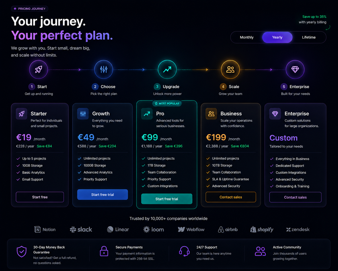
- Plans with: icon tile, name, one-line positioning, big price, period, feature list with circular check icons, CTA button, small reassurance line under the CTA
- A bottom trust bar with 4 items: money-back guarantee, secure payments, 24/7 support, social proof

Interactions:
- Billing toggle (Monthly / Yearly / Lifetime) with a sliding violet pill using layoutId and spring physics
- Prices must animate between billing modes with an animated number counter (no instant swap)
- A "Save up to 35%" badge that pops in with a spring when yearly is selected
- Each card lifts on hover with a violet glow and a cursor-tracked light reflection across the glass
- Feature rows fade and slide in with a 0.05s stagger when the section enters the viewport
- The recommended plan pulses very slowly (scale 1 -> 1.01) and carries a floating "Most Popular" badge

Do not:
- Use flat cards without depth
- Use fast, bouncy or distracting animation
- Ship non-responsive layouts or clipped badges (badges must live outside overflow-hidden containers)


---

TECHNICAL SPEC (must be respected)

Stack:
- React 18 + TypeScript (strict), Tailwind CSS, Framer Motion
- No extra animation library, no canvas unless explicitly required

Design tokens:
- Base background #0a0a0f, surfaces rgba(255,255,255,0.04)
- Borders rgba(255,255,255,0.08), primary violet #8b5cf6, secondary #a855f7
- Radius 20-28px, backdrop-blur(24px), inner highlight inset 0 1px 0 rgba(255,255,255,0.12)
- Typography: tight tracking on headings (-0.02em), 15-16px body, muted text at 60% opacity

Motion rules:
- Entrance: opacity 0 -> 1, y 24 -> 0, duration 0.7s, ease [0.16, 1, 0.3, 1]
- Stagger children by 0.06s, trigger with useInView({ once: true, margin: "-80px" })
- Hover: translateY(-6px) + soft violet glow, 250ms
- Animate only transform, opacity and filter. 60fps, will-change on animated layers
- Respect prefers-reduced-motion: disable loops, keep final states

Quality bar:
- Fully responsive (mobile-first, no horizontal scroll)
- Accessible: semantic HTML, focus-visible rings, contrast AA
- No layout shift, no dummy lorem ipsum, realistic copy
- Clean, reusable, production-ready components with typed props

Deliver the complete code, ready to paste, with no placeholder comments.Pourquoi ça fonctionne
Laisser l'utilisateur construire son offre augmente l'engagement et la valeur perçue : chaque interaction rapproche du paiement.
Utilisation idéale
SaaS usage-based, services sur mesure, plateformes B2B.
Avis
"Utilisé pour un client barber, résultat premium en 10 minutes. Le meilleur investissement."
Sarah M.
"Le prompt fonctionne parfaitement dans Lovable. La qualité du rendu est bluffante."
Julien K.